Logo Rules
Usage
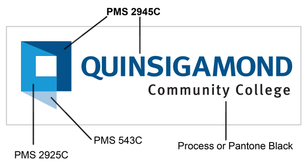
- The four color logo is for full-color applications, such as brochures, flyers, websites, posters, brochures, letterheads, and business cards.
- A one-color logo is for single-color applications such as fax cover sheets, promotional items, documents printed on black and white laser printers, etc.
- The logo may be reduced to 1.5 inches wide
- The logo must always be legible
- Do not distort, reposition elements, or alter parts of the logo in any way. If you need to resize the logo, please only resize using the corner handle of the image (Microsoft Word), rather than the sides, as this will distort the image. In Photoshop or other image programs, pressing shift while resizing will keep image proportions.
Printing
- For full-color printing, use CMYK colors (Known as “process colors”) as per file specs.
- Each PMS color has an associated CMYK color, i.e: 2945C = 98, 74, 4, 0. See color printing 101.
- PMS Stands for Pantone Matching System –A print industry standard for color matching. “C” = coated, “U” = uncoated, “M” = matte, for the different types of paper.
- Please note that the four-color QCC logo cannot be reproduced using various screens of PMS 2945C.
- The logo should always be displayed in as high quality as possible, preferably using a vector format when available.
- All reproductions of QCC’s logo or mascot must be approved by the Office of Institutional Communications
- If the logo is being printed on materials where PMS 2945C will not be highly visible, a solid white or black logo is acceptable.
Safe Space
- Safe space around the logo assures that it has maximum visibility and impact wherever it is used. As illustrated, the height of the Q icon in the logo is the standard unit of measurement in calculating the safe space.
- The height is always relative to the size of the logo being used.
- The safe space on each side of the logo should be equal to or greater than the height of the Q icon.
- Do not violate this space with any text or graphic elements
ColorsQCC's official colors are:
Sub-colors
| FontsPrint Fonts QCC uses several fonts in professional materials. The following are recommended:
Web Fonts The website uses the following fonts:
|
Logos
 | Full Color Logo |
 | 1-Color Logo |
 | White Logo |
 | Black Logo |
 | Wyvern |
 | Brothers & Keepers Logo |
 | College Seal |
 | Powerpoint Templates |
 | Zoom Backgrounds |
The mythological dragon-like creature that is QCC’s mascot has a very distinctive look. As many of you know, QCC not only has a logo, but also has a mascot, the Wyvern. Over the years the lines have become blurred in the way in which the Wyvern and the logo have been used.
In collaboration with the Executive Leadership team, we have devised clear usage of both the Wyvern and the logo moving forward. The Wyvern will now exclusively be used for athletics, sports teams, Student Life and clubs, while the QCC logo will be used for academics, workforce development and other program-related areas.
This style of branding is similar to the way most colleges and universities use their logo and mascot and presents a more professional and collegiate way to represent QCC. Branding is an important part of the identity of any business, college or university. It is what is most identifiable, yet when branding becomes watered down it causes confusion and ineffectiveness.
QCC follows the New York Times Manual of Style and Usage.
- Abbreviations for Days of the Week: Mon., Tue., Wed., Thu., Fri., Sat., Sun.
- Phone number format: 508.854.7513
- Usage of any acronym requires that it is spelled out completely the first time it is used, followed by the acronym in parenthesis. Additional mentions then use the acronym without parenthesis.
- Dates are written as July 2, 2012 or December 31 – with no ordinals, i.e., 1st, 2nd, etc.
- Time is written as 10:00 a.m. or 2:30 p.m.
- Our Student Portal, The Q, is italicized and both words are capitalized. Do not use quotations for "Q".
QCC Locations
Campus locations are written as follows:
- QCC Main Campus
- QCC at Southbridge
- QCC at the Center for Workforce Development and Continuing Education
- QCC at the Worcester Senior Center
- QCC at Burncoat High School
Degrees
- Degrees such as associate degree and bachelor's degree are lowercase unless referring to a specific program
- Associate of Arts in Elementary Education
- Associate of Science in Engineering
- Bachelor of Science in Biology
- Dental Assisting Certificate
-
nonspecific: a degree in business administration, a certificate from Quinsigamond Community College, an associate degree in healthcare
URLs
- URLs using www.QCC.edu must be written with QCC in caps.
- Words in the URL after the slash may be lowercase, unless there is more than one, in which case the text must be title case (e.g. www.QCC.edu/success or www.QCC.edu/FinancialAid).
Color Printing 101
CMYK (Or process color) is referred to as subtractive color and uses just four inks applied in order, separately, to create all colors. (“Subtractive” because it is applied against white, reducing or subtracting the light that would otherwise be reflected.) CMYK colors are Cyan, Magenta, Yellow, and Black.
RGB color is the additive process where red, blue, and green light is applied together against black to create all colors. Used in TV, computer monitors and digital photography images. RGB color is device dependent.
QCC Promotional Items
A variety of promotional items sanctioned for use at QCC Events are available for purchase from the Office of Institutional Communications (IC). These items are imprinted with the QC logo or wyvern mascot as appropriate. IC will also special order items as necessary and will recommend preferred vendors.
A sample list of QCC promo items is included here. For a more complete list and an order form, contact marketingdepartment@qcc.mass.edu.
- T-shirts
- Polo Shirts
- Pens and Highlighters
- Mouse Pads
- Frisbees
- Water Bottles
- Flexible Flyers
QCC Business Items
IC Produces name badges, business cards and letterheads for employees. Please use the form supplied by IC for name badges. For business cards and letterheads, send information in an e-mail message directly to Rose. (Completed business card and letterhead orders are available for pick up in the Print Shop)
Items can take as long as 3 weeks to process; please maintain accurate inventory and allow appropriate lead-time for your order to be completes. Rush jobs are not possible.
Best practices
- Make your content skimmable
- Frontload: Put your main idea at the beginning.
- Use the language your audience uses. Aim for a readability score of Grade 8-9. Use the Hemingway Editor to assess.
- Be user-centric, not organization-centric. Focus on user tasks. Write for students, not yourself or your office.
- Be conversational. Use contractions and first- and second-person voice (“we” and “you”),
- Remember that content is more than just text. Consider whether imagery, statistics, or videos may be a more effective way to convey your message than text. (Use photos, but not images with text on them. These are not ADA compliant in most cases.)
- Use bullet points
- Write as clearly and concisely as possible and keep your sentences and paragraphs short (three sentences or less).
- Use specific detail to show rather than tell.
- Use In-line links to other pages (instead of lists or bare URLs)
- Keep a page word count over 300 words – if you don’t have enough (and don’t add text just to fill this number), then maybe it should be part of an existing webpage.
- Instead of duplicating content, link to existing content or make a note that content will need to be duplicated programmatically so that we can avoid changing it twice.
- Program department pages should be condensed to one page and added as an extra information block on program pages instead of existing as their own.
- It is OK to use an ampersand in menu titles and headers, but all other wording on the page should use the word “and”. Do not use other chatspeak or shorthand such as @.
What to avoid
- Long blocks of text and complex sentences
- Ambiguous headlines and subheads
- Passive voice
- Jargon and blah-blah text (e.g. collegial-speak like “cohort”). You are writing for prospective students.
- Unsupported adjectives (innovative, first-class, remarkable, unique)
- Too much bold or italics -- if everything is emphasized, nothing is
- Too many menu items -- difficult to scan & understand
- Archives of content - Do not archive old materials such as past events, presentations, photos, etc.
- Vague or empty content - Do not use language such as “welcome to the advising website”. You should jump straight into services offered instead of writing introductory letters.
- FAQs. Rewrite FAQ sections into actual content. (e.g. “How do I apply?” > “How to Apply”)
- “click here” language. Use descriptive links like “view the schedule” or “apply for the program”. People know how to click a link.
- Events should not be manually added to pages. They will be added in event type format to calendars which will auto—populate on the appropriate pages
- Staff/Faculty/Employees should not be manually added to pages. These will be populated by the Active Directory and added to appropriate pages.
- Events, FAQs, News, and Staff should not have their own pages and instead be populated as sections on the appropriate page.
Explanation
- Combine similar content and pages that have too little text – Google penalizes pages with too little content in terms of our search rankings. With hundreds of pages already on the site, a new page shouldn’t be created unless there is a need. Too many pages makes it hard for students to find what they are searching for.
- Remove archives (such as past events, presentations, photos, etc.), old info, and lists of off-site links – We are trying to keep only the basics on the website—too much content hinders the ability to have a clean, organized website. We do not want students finding and using old versions of documents, or finding the wrong event dates from years past.
- Rewrite FAQ sections – FAQs complicate content that could be organized in a simpler way. Instead of a list of questions, you should reorganize content into short headlines and copy that can easily be skimmed to find answers. Students may not have formulated their question in the exact way you have it worded in an FAQ.
- Automate staff, events, and contact info – we want to pull this data from existing directories so that it can be used in multiple places. We also want this to be uniform instead of having people put this wherever they like on different pages. This also prevents duplicate and outdated content (showing old events or staff members makes us look unprofessional)
- Remove non-prospective student, staff, or sensitive info and move to the intranet/Q – the qcc.edu website is primarily for prospective students. If they see info for faculty and staff/other audiences where they expect to see content suited for themselves, it drives them away and makes for a busier website. We need them to be able to find what they want in a few clicks instead of swimming through unrelated content that can be housed elsewhere.
Project Request
To request a project from institutional communications, please fill out the form.
Photo Releases
See below for College photo releases.
Have Questions?
All official college entities should follow these brand guidelines. For assistance or with special requests, please contact Institutional Communications.
